
Scaler
How do you make a 0→1 specialised ATS & Recruitment platform with a live pool of thousands of candidates?
- Role
- Product Design Intern
- Team
- Head of Design, me, 1 PM, 2 engineers
- Timeline
- January to April 2023
The one-minute version
The problem
The legacy recruitment platform was hard to navigate and dense with information, and its UI made a mistake in data entry or retrieval very likely.
What I designed
A specialised ATS and recruitment platform where recruiters create jobs, and track and edit every candidate and job pipeline.
My ownership
- 1End-to-end UI
- 2The complete IA for the job creation flow
- 3Edge case identification and design states
- 4UX copy
Outcome reported by recruiters in PM-led interviews one quarter after launch
Reduced 55 hours/month
Decision latency for recruiters
2x
Business unit productivity
The long version, about three minutes
Context
Scaler sells upskilling to graduates of tier‑3 colleges and helps them get placed.
But the courses are on YouTube for free too. The real business is what Scaler collects about each candidate through assessments, tests and projects, which gives recruiters more context than a résumé. So placement is the core business.
33,700+
Candidates in the system
An off-the-shelf ATS couldn't be used, because Scaler's evaluation data (MBEs, modules, tests) is what it sells to recruiters.
Before
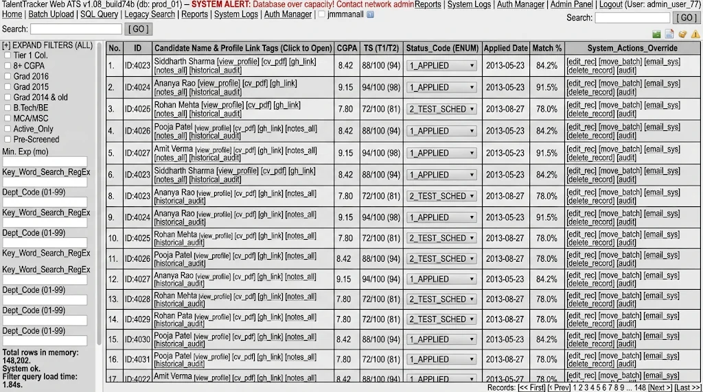
The recruiters were struggling with
a.Creating a new job
A guided 4-step process with progressive disclosure to reduce information overload.
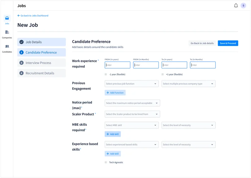
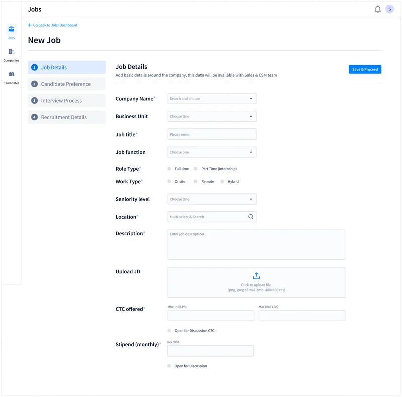
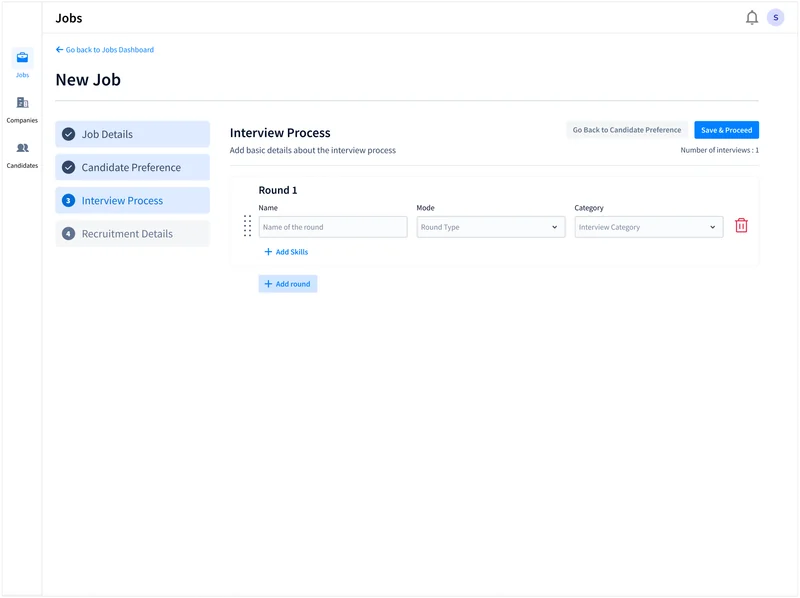
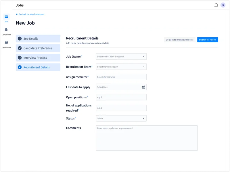
I owned this flow's complete IA and UI. It splits a new job into four steps, each a page of its own: Job Details, Candidate Preference, Interview Process and Recruitment Details.
Key considerations while designing and testing with users
Each field takes the input that fits its answer: drop-downs, textboxes, checkboxes and multiselects.




A field says how it works where it is filled in: Location reads “Multi-select & Search” inside the box.

Ticking −1 year (flexible) on a six-month minimum would take it below zero, so the form says what applies instead: 0 years.

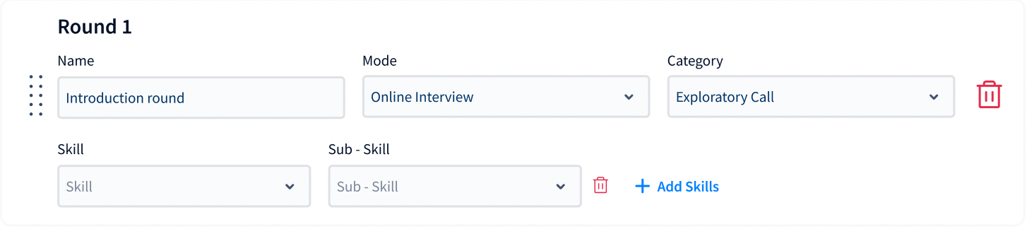
A round asks for its name, mode and category first. Skills and sub-skills appear only once one is added.

b.Tracking pipelines
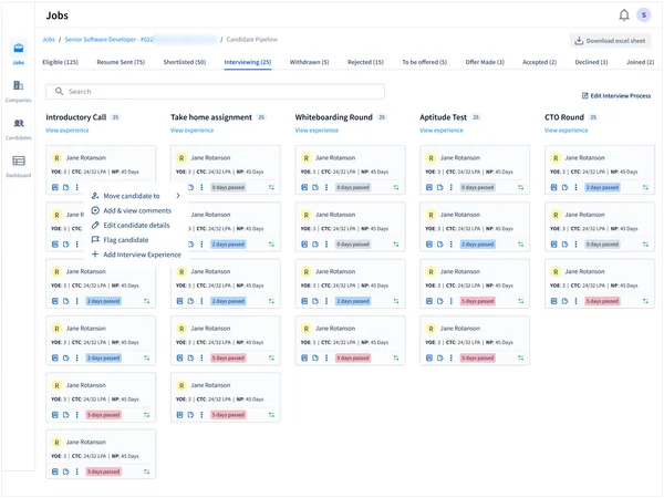
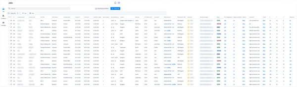
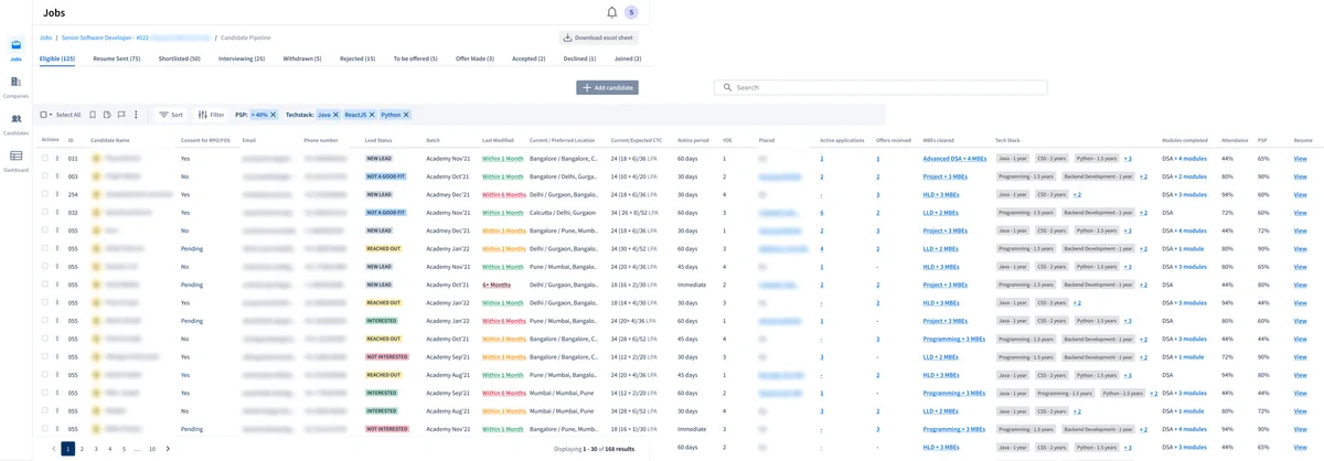
Every job in a single view with a simplified structure to view pipelines.
I owned the UI through multiple iteration cycles and tested it with recruiters. I received design requirements and IA from my manager.
Clicking View in the Pipeline column opens that job's pipeline, with a tab for each stage.
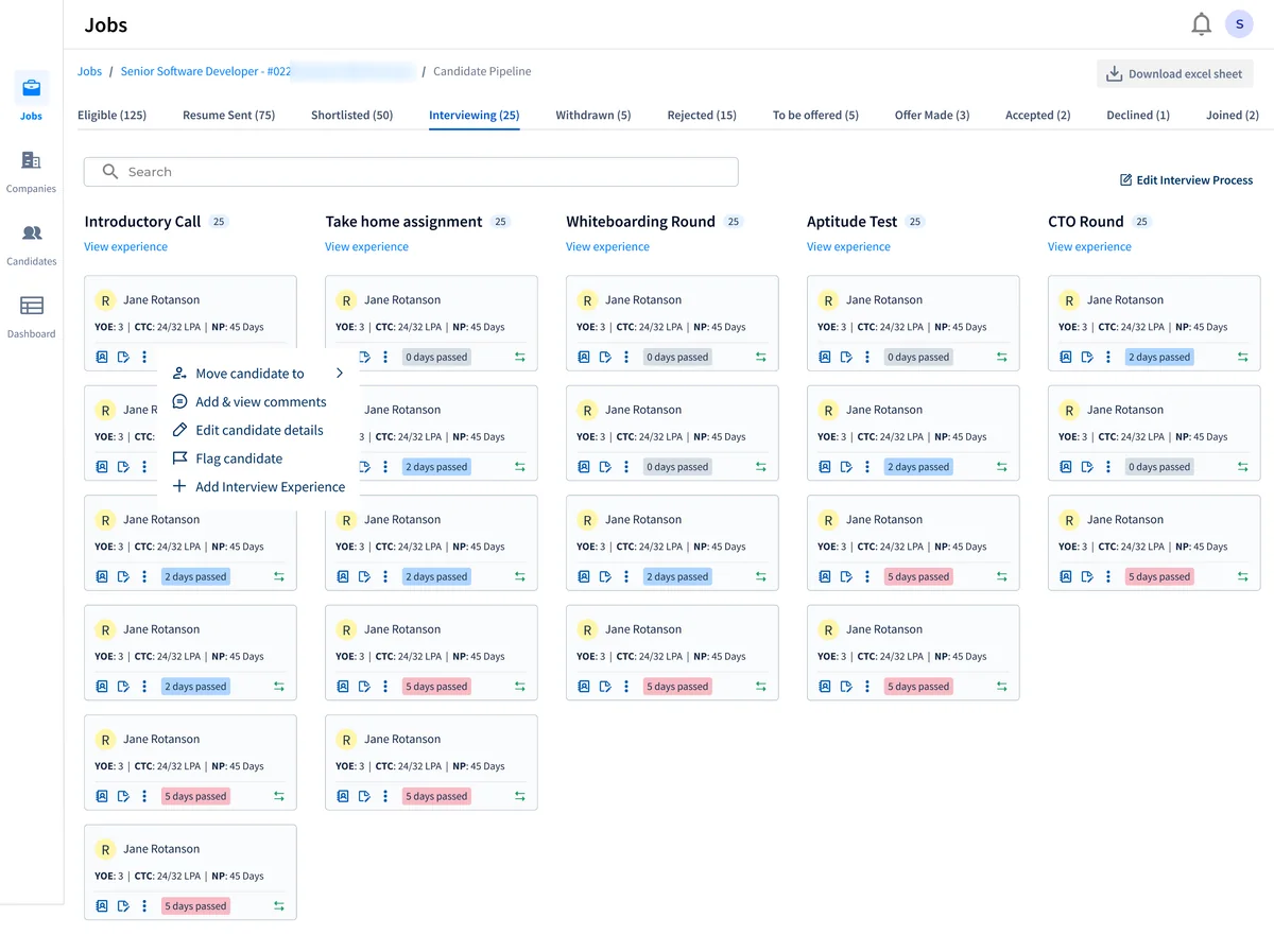
c.Evaluating candidates and jobs
Modals across these workflows to help recruiters leave comments, gather feedback, and edit requirements.
I owned the content, UI and testing. My Head of Design brought the requirements and reviewed the work.
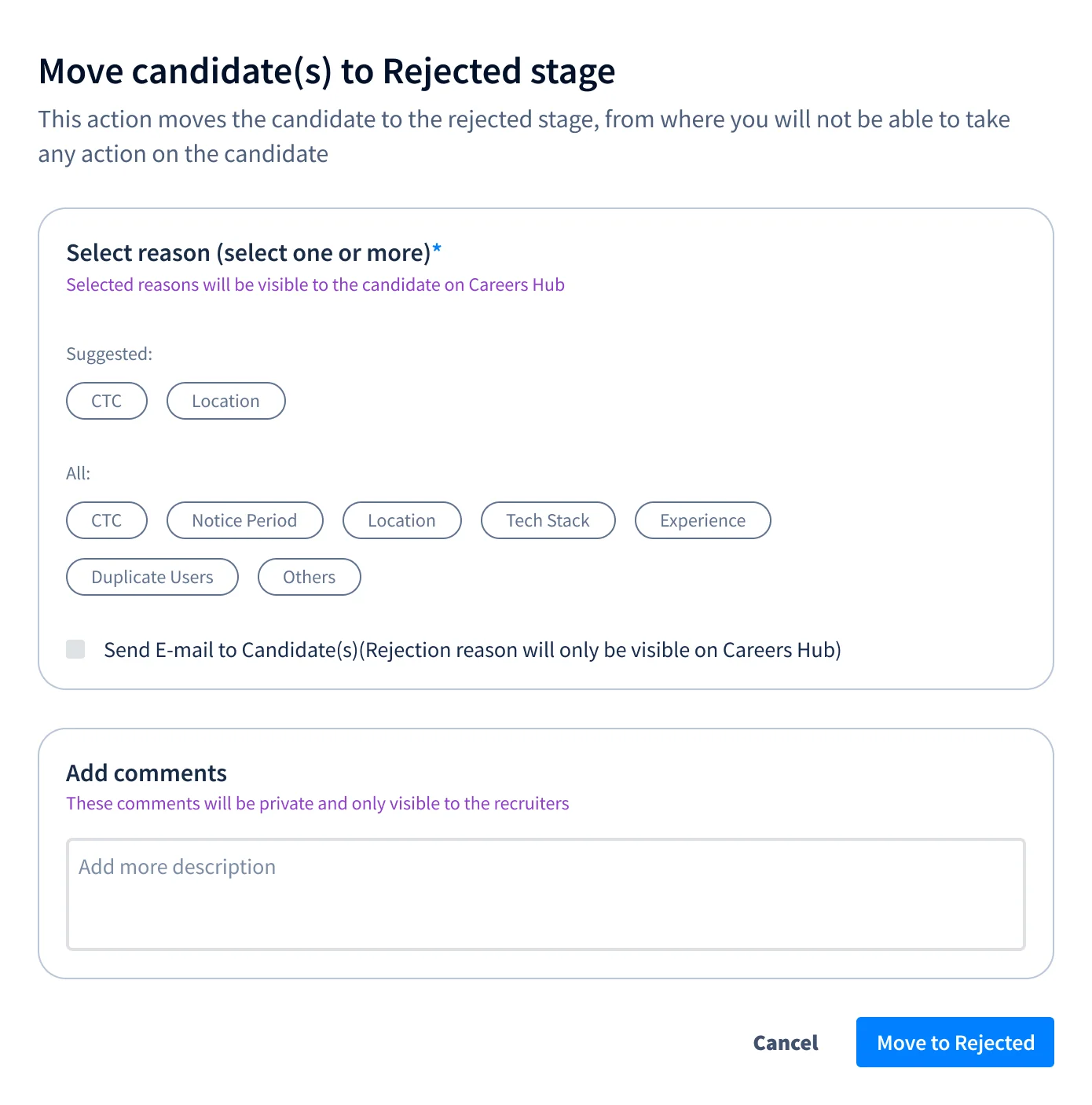
A rejection takes one or more reasons, the likeliest suggested first. The candidate sees them on Careers Hub and can be emailed; comments stay with recruiters.
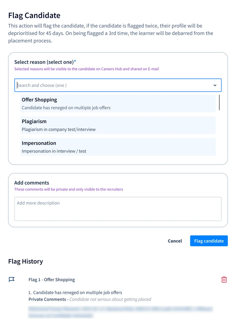
A flag takes a set reason, which the candidate sees, and a comment only recruiters see. Two flags deprioritise a profile for 45 days, and a third debars the learner from placement.
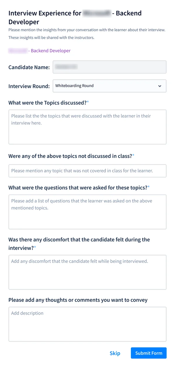
After a round, what the learner says about it is recorded: the topics, the questions, anything not covered in class and any discomfort. It is shared with the instructors.
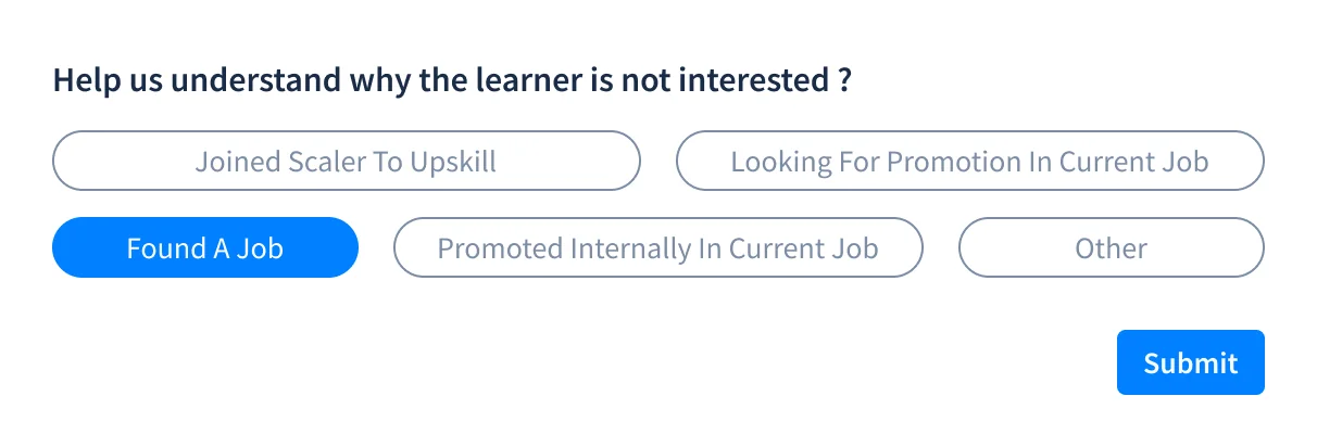
Marking a learner not interested asks why: joined Scaler to upskill, looking for a promotion, found a job, promoted internally, or other.
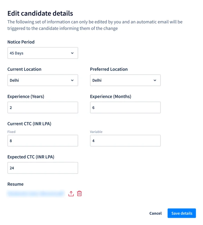
Notice period, location, experience, CTC and résumé can be corrected here, and the candidate is emailed about the change.
d.Filtering candidates and jobs
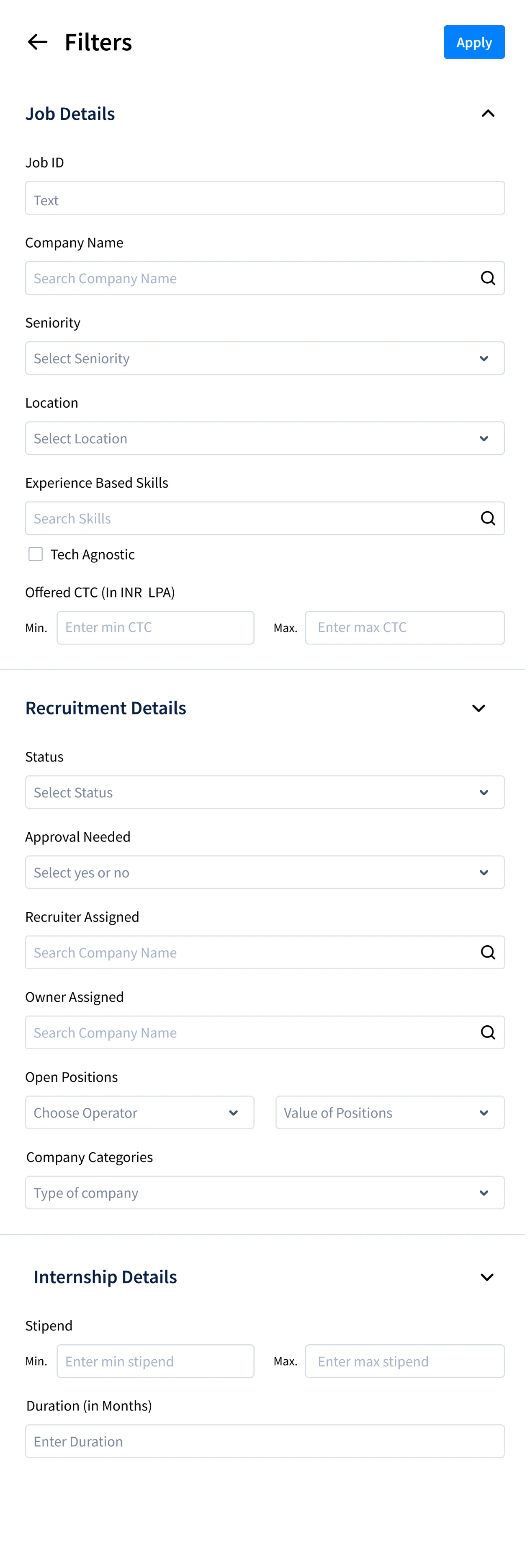
Filters for quickly navigating these dashboards.
Each filter only shows the information frequently viewed by recruiters and I tested it with them to refine the information hierarchy and input fields.


Outcome
Scaler's core business is getting candidates placed, the platform needs to be efficient with no room for errors.
Reported by recruiters in PM-led interviews one quarter after launch
Reduced 55 hours/month
Decision latency for recruiters
2x
Business unit productivity
0→1 build
from scattered dense spreadsheets of data
Reflection
1. In a live, two-sided ecosystem handling sensitive data, success isn't just about improving efficiency. The best experience doesn't just make work faster; it fits naturally into existing workflows, minimizes the learning curve, and earns users' confidence.
2. Building 0→1 I realised that design freedom is really prioritization responsibility. The challenge isn't figuring out everything the product could do; it's deciding what it needs to do well first.
3. The startup environment meant the UI and changes had to be shipped quickly and there wasn't a lot of time to dive into research. With design times reduced because of AI now, I'd be more proactively iterating and testing with users to reach an optimal solution quicker.